 In this section we'll introduce the Widgets framework, and enhance our GuestBook application from Part I using some key Widgets components:
BasicPageWrapper
In Part I we wrapped our page level content with an <a:PageWrapper> to put our content in a properly structured HTML document
(and get Auto AJAX refresh support). In Widgets apps we instead wrap our pages in BasicPageWrapper (or an analog, like
ModalPageWrapper). Let's alter our example accordingly:
 This change in page wrapper brings several changes, some more immediately apparent than others:
- A CSS stylesheet,
widgets.css is included which restyles basic fonts, heading styles (and provides styles for controls)
- The page gains a "masthead" (with an application logo), and a "command bar" area
- An "AW Options" menu appears inconspicuously at the top
A subsequent section discusses Branding (i.e. changing the logos and styling to match your requirements). For now, let's explore that
"AW Options" menu...
Component Inspector
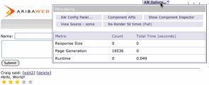 The AWOptions menu is visible only when our application is launched in debug mode (i.e. with AWDebugEnabled).
Opening the menu (itself implemented with PopupMenuLink, PopupMenu, and PopupMenuItem) reveals
some interesting options, and some statistics. Note that AW is tracking some useful stats on page size and
request handling run time.
The AWOptions menu is visible only when our application is launched in debug mode (i.e. with AWDebugEnabled).
Opening the menu (itself implemented with PopupMenuLink, PopupMenu, and PopupMenuItem) reveals
some interesting options, and some statistics. Note that AW is tracking some useful stats on page size and
request handling run time.
 Probably the most important is Component Inspector. Clicking "Show Component Inspector" will pop open a second
browser windows displaying the component hierarchy involved in the current page (As you subsequently navigate the
app, the Component Inspector will automatically update to reflect the new location).
Probably the most important is Component Inspector. Clicking "Show Component Inspector" will pop open a second
browser windows displaying the component hierarchy involved in the current page (As you subsequently navigate the
app, the Component Inspector will automatically update to reflect the new location).
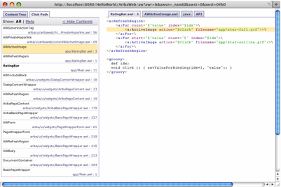
From the Component Inspector tree we can "X-Ray" through the page to reveal both the components involved
and the source component and line number that is bringing them in. (Note that with the IDEA or Eclipse
plug-ins you can click on these source location hyperlinks and your IDE will
automatically jump the the corresponding source file).
We can also drill in on a particular element of interest by Alt-clicking on controls in the main window. Component Inspector
will shift to "Click Path" mode and show the stack of component leading to the element that was clicked.
In either mode, we can use the tabs on the right to see the source code (.awl and .java) of the component involved, and even
see highlighted the line of the reference.
Exploring example applications with Component Inspector is a highly effective way to learn AribaWeb.
There are a number of other tools accessible "live" from the AWOptions menu. For now, though, let's
see how we can take advantage of components in the widgets framework to enhance our GuestBook application...
So far (in Part I) we've been working with basic HTML analog elements to build our interface. But a big part
of the development leverage you get with AribaWeb is through its extensive set of reusable Widgets.
These widgets are just AWComponents (just like the RatingBar that we built in the last section) and
you can always supplement the provided set with your own, but the supplied set is great to get you
started.
Let's start by going with a left/right layout for our GuestBook. We could use some divs or tables
to do this ourselves, but the FourZoneLayout control provides a clean solution.
<w:BasicPageWrapper hasForm="$true">
    <w:FourZoneLayout>
        <a:Content name="left">
            Name: <a:TextField value="$newPost.userName"/><br/>
            ...
        </a:Content>
        <a:Content name="right">
            <a:For list="$posts" item="$currentPost">
            ...
        </a:Content>
    </w:FourZoneLayout>
</w:BasicPageWrapper>
Notice that FourZoneLayout takes multiple AWContent elements in its body (we're using the one's named "left" and "right", but it also supports "top" and "bottom" as well). If we browse into the implementation
of the widget (feel free to alt-click in the form to bring up Component Inspector and take a look) we'll
see that it uses AWIncludeContent to include the various content areas it is passed in appropriate
placed in its template.
Another common layout issue is with Forms. To illustrate the issue, let's first extend our Post model
by letting posters enter their birthday. In Post.java we'll add:
import java.util.Date;

public class Post {
    public String userName;
    public Date birthday;
    ....
And let's add a date control to the UI:
Name: <a:TextField value="$newPost.userName"/><br/>
Birthday: <w:DateField value="$newPost.birthday"/><br/>
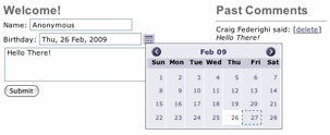 The date picker is nice, but it's now clear that our form labels and controls aren't nicely aligned.
This is where FormTable comes in:
<w:FormTable omitLabelPadding="$true">
   <w:FormRow label="Name">
        <a:TextField value="$newPost.userName"/>
   </w:FormRow>
   <w:FormRow label="Birthday">
        <w:DateField value="$newPost.birthday"/>
   </w:FormRow>
   <w:FormRow label="Comment">
        <a:TextArea cols="35" rows="4" value="$newPost.comment"/>
   </w:FormRow>
   <w:FormRow>
        <a:SubmitButton action="$add"/>
   </w:FormRow>
</w:FormTable>
 The FormTable expects FormRows in its body. Each FormRow, in turn, takes a label, and content
for its widget.
The FormTable expects FormRows in its body. Each FormRow, in turn, takes a label, and content
for its widget.
The result is a nicely aligned set of labels and controls.
How do we get our newly provided birthdays to be formatted to display in the "Past Comments" area?
That's where AWFormatting and the formatter binding on AWString (and AWTextField) come in.
Let's add a date field to our past comments area as so:
$currentPost.userName
(<a:String value="$currentPost.birthday"
           formatter="$formatters.shortDate"/>)
 With that our date is nicely rendered in a compact (and auto-localized) manner. So where did this list
of formatters come from? The short answer is: AWVFormatterFactory. The long answer (and please only
read the rest of this sentence if you're ready for some confusion...) is that AWVFormatterAccess defines a ClassExtension on AWComponent (think AOP) that causes FieldValue to resolve access to the
With that our date is nicely rendered in a compact (and auto-localized) manner. So where did this list
of formatters come from? The short answer is: AWVFormatterFactory. The long answer (and please only
read the rest of this sentence if you're ready for some confusion...) is that AWVFormatterAccess defines a ClassExtension on AWComponent (think AOP) that causes FieldValue to resolve access to the formatters key to a (localized) map of formatters returned by AWVFormatterFactory.formattersForComponent() -- if you wanted your components to use a different (or extended) set of formatters you could provide an alternate accessor to return yours.
Next, let's add Validation. As it turns out, the DateField is already performing validation
(ensuring that any date that we type in can be parsed into a Date object). However, our add()
action is currently proceeding without taking heed of any validation errors. We can change this
by adding one line to our action:
public void add () {
    if (errorManager().checkErrorsAndEnableDisplay()) return;
    ...
This will bail out of our action with error display enabled if the AWErrorManager associated with this component (and page) has any outstanding errors.
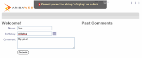 With this we get a validation banner at the top of our window upon our trying to add a post with an
unparseable date.
With this we get a validation banner at the top of our window upon our trying to add a post with an
unparseable date.
But we can do better. We'd like to see the error indicated right on the field where it occurred.
Turns out FormTable can do that for us via it's showErrorFlags binding. And while we're at it, let's
also mark the name field as required:
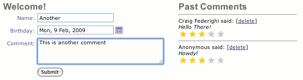
<w:FormTable showErrorFlags="$true" omitLabelPadding="$true">
    <w:FormRow label="Name" required="$true">
        <a:TextField value="$newPost.userName"
                     formatter="$formatters.requiredString"/>
    </w:FormRow>
    ...
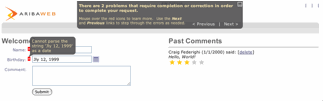 Note that this time we're seeing red error indicators next to the fields with errors, with a bubble on
the current field displaying the relevant error message. The error display at the top now provides controls
to let the user move back and forth between the errant fields.
Note that this time we're seeing red error indicators next to the fields with errors, with a bubble on
the current field displaying the relevant error message. The error display at the top now provides controls
to let the user move back and forth between the errant fields.
If we wanted to provide other more global validation (perhaps checking if a user had posted too many
times) we could perform such a check in our add() action just prior to the checkErrorsAndEnableDisplay()
check, calling `errorManager().recordValidationError(...) with any errors we find.
(Note: MetaUI -- which we cover in the next chapter -- provides a more declarative way to associate
validators with fields and generate the required UI automatically).
Rich Text
Up to now we've been using an AWTextArea to capture the Post comment (and an AWString to render it).
Our GuestBook could be improved by enabling users to enter rich text for their comments. We can do
this using Widget's RichTextArea component.
In Main.awl, we'll change our <a:TextArea> tag as follows:
<w:FormRow label="Comment">
     <w:RichTextArea value="$newPost.comment"/>
</w:FormRow>
And because we want to allow (safe) HTML to be rendered unescaped, we'll change the element that renders the
post as follows:
<a:String escapeUnsafeHtml="$true" value="$currentPost.comment"/>
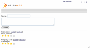
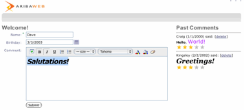 With these changes in place our UI looks like this:
Note that AribaWeb is making sure that malicious HTML (for instance, embedded javascript intended to carry out
a cross-site-scripting attack) is escaped (and thereby rendered harmless) by these controls.
DataTables
Business user interfaces often display tabular data. The AribaWeb AWTDataTable component
provides an easy and versatile control for such interfaces. Provide a table alternative to our
current "Past Comments" list UI:
<t:DataTable title="Posts" list="$posts" item="$currentPost">
    <t:Column key="userName"/>
    <t:Column key="birthday" formatter="$formatters.shortDate"/>
    <t:Column label="Rating">
        <x:RatingBar value="$currentPost.rating"/>
    </t:Column>
    <t:Column>
        <w:TextButton action="$deleteCurrent">Delete</w:TextButton>
    </t:Column>
    <t:RowDetail style="padding-left:20px">
        <i>$currentPost.comment</i>
    </t:RowDetail>
</t:DataTable>
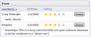 Notice how, as with
 <a:For> we can pass a list binding to our List of posts. But the DataTable
treats its contents very specially: all of its content elements are Columns and the datatable
takes care to render them two ways: as column headings at the top, and as data cells, for each row.
Notice also that some <t:Column> tag themselves have content (which is rendered for each cell),
while others simply specify a key -- that key is used (via the FieldValue protocol) to extract
the value to display (possibly running it through a provided Formatter).
Notice also the RowDetail element: this is a special "column" that is rendered below the data cells
for each row, providing space for long form data.
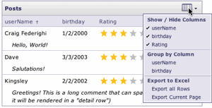 Because the table columns are "structured", the table can provide a number of useful features automatically.
For instance, by binding
Because the table columns are "structured", the table can provide a number of useful features automatically.
For instance, by binding showOptionsMenu="$true" the table options menu appears, providing options to
hide and show columns, group data, and export to excel.
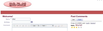
TabSets
Another component that handles its content elements specially is TabSet. A TabSet provides a list of tabs to choose between and renders the selected tab. We can define a TabSet to choose between our List
and Table-based renderings of the GuestBook as follows:
<w:TabSet>
    <w:Tab label="List">
        <a:For list="$posts" item="$currentPost">
...
    </w:Tab>
    <w:Tab label="Table">
        <t:DataTable title="Posts" showOptionsMenu="$true"
                     list="$posts" item="$currentPost">
...
    </w:Tab>
</w:TabSet>
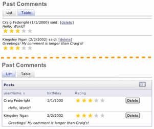 Here we see the results, with each of the two tabs selected in turn. Note that clicking between the tabs
only updates the part of the document containing the tab content, not the rest of the window. This
is due to the TabSet's use AWRefreshRegion to wrap its content.
Here we see the results, with each of the two tabs selected in turn. Note that clicking between the tabs
only updates the part of the document containing the tab content, not the rest of the window. This
is due to the TabSet's use AWRefreshRegion to wrap its content.
Modal Panels
In the end of Part I we added the ability to edit a post by transitioning to a separate "Edit Post" page.
The destination page is essentially "modal" -- the user needs to complete an action on that page and return
to the calling page. Widgets provides the ModalPageWrapper to both simplify the implementation and improved
the visuals of such pages.
We'll start by changing the original EditPost.awl file from using <a:PageWrapper> to <w:ModalPageWrapper>:
<w:ModalPageWrapper title="Edit Post">
    Name: <a:TextField value="$post.userName"/><br/>
    <a:TextArea cols="50" rows="4" value="$post.comment"/><br/>
</w:ModalPageWrapper>
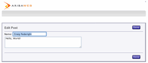 You'll note that the new code is simpler than before, and there result is nicer:
- The title is now a binding on the wrapper
- We no longer need a Submit button nor the code to return to the previous page: the ModalPageWrapper handles the "Done" handling for us automatically!
- We get a distinctive rendering that signals to the user that this is a modal interaction
Still, a better UI would be to pop open the edit in a panel without leaving the original page. What do we have to
do to achieve this?
We can simply change our action in Main.awl to this:
<a:Hyperlink action='${pageWithName("EditPost",
                          [post:currentPost, clientPanel:true])}'>
    edit
</a:Hyperlink>
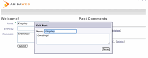 I.e. by simply calling
 setClientPanel(true) on the newly created EditPost page, it will render itself in a javascript panel!
Don't be misled (by seeing the AribaExpr expression directly on the AWHyperlink) into believing that the link itself somehow
needs to encode to the client that it will result in a panel; that action does not fire until the click, and only then does
logic on the server make the determination that a page transition is taking place and that the destination page should be
rendered in a panel. This affords tremendous flexibility: for instance, such an action could determine that a validation error
has occurred and that the user should not yet be allowed to transition to the panel. (Pure client-side confirmation panels are
also possible: check out the Confirmation component).
Branding
Widgets application initially inherit the default AribaWeb "brand". However, applications can override the CSS styles
and image resources that create that look to style the application differently. In AW terminology this is called "rebranding".
In our sample application we'd like to change the application logo (in the upper left) to refresh our "Hello World"
identity and we'd like to move to a red color scheme. We'll start with the logo. The AWResourceManager supports
overriding resources by putting replacements in a "resource directory" (path) that was registered earlier in its search
order. Let's find out the name of the logo image that we want to replace.
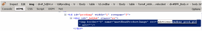 A great tool for this is Firebug (in Firefox) or the "Inspect Element" command now available in Safari 4. By inspecting
the logo image we can see that it is names "cmdbar_prod.gif".
A great tool for this is Firebug (in Firefox) or the "Inspect Element" command now available in Safari 4. By inspecting
the logo image we can see that it is names "cmdbar_prod.gif".
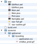 Branding overrides are best placed in the path
 resource/webserver/branding we'll put our replacement file there.
We also want to change some of the CSS styles currently used by widgets.css. By convention, AW will load
an extra CSS file called application.css -- we'll create a new file with that name in the branding directory as well.
Again using Firebug or Safari 4 we can determine the styles being used to render the grey command bar.
Turns out that we need to remove the background images that apply the rounded edges to the elements styled cmdLeft and cmdRight and set a background color. While we're at it, we'll apply some color to our H1 headings as well:
.cmdBarWrapper .cmdLeft,
.cmdBarWrapper .cmdFill,
.cmdBarWrapper .cmdRight {
    background-image:none;
    background-color:#BD5152;
}

.cmdBarWrapper .mastCmdContainer {
    padding:0px;
}

h1 {
    color:#691331;
}
 With these files in place our UI looks quite different. If we want to take this even further, we could
override the
With these files in place our UI looks quite different. If we want to take this even further, we could
override the AribaBasicPageWrapper.htm template altogether.
It's important to note that AribaWeb's approach is to layer/override your resources and CSS styles on top of those
provided by Widgets, not to for you to copy and mutate the bundled copies. This way, as you pick up new versions
of AribaWeb in the future you don't have to perform a painful diff/merge.
You can find the source code for the final version of this example in examples/GuestBook
Other Areas to Explore
We've explored just a handful of the more than 100 components included in the Widgets framework.
You'll want to explore the online examples (e.g. the "Demo" app) and the JavaDoc (and don't forget about using
Component Inspector!) to learn more. Here are just a few especially worthy of further study:
Next up: Part III: MetaUI