Chooser
The Chooser widget is an AJAX auto-completion selection control.
It supports both single and multi-select.
We'll build on our GuestBook application as follows:
- Switch our continent picker to use a Chooser
- Add a custom Chooser panel to select a continent from a map
In this guide, you will learn about:
A pre-requisite to this guide is MetaUI.
GenericChooser
Using component inspector on the continent picker,
we can find this rule in WidgetsRules.oss:
field {
    ...
    type=java.lang.Enum   {
        editable                {
            component:GenericChooser;
            bindings:{
                ...
If we have an editable enum field, then the default component is GenericChooser.
The GenericChooser switches in some form of selection control (Popup, Radio Buttons, Checkboxes, Chooser).
based on the number of items in the list.
We can make it a little more interesting with this tweak in rules.oss:
class=app.Post field=continent operation=create {
    bindings:{
        type:Chooser;
    }
}
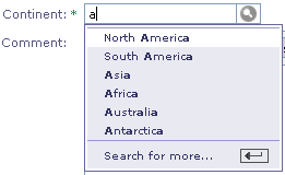
Notice that auto-complete happens as you type.
The up and down key can be used to navigate between the matches.
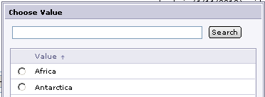
Clicking on "Search for more..." brings up the default panel with a search box.
You will find the implementation at ChooserPanel.
Let's look under the hood and see how Choooser works,
and see to use it directly...
Using the Chooser
We start by changing the rule to this in rules.oss:
class=app.Post field=continent operation=create {
    component:Chooser;
    bindings:{
        selections:${chooserSelections};
        state:${chooserState};
        selectionSource:${chooserSelectionSource};
        allowFullMatchOnInput:true;
    }
}
The chooserSelections, chooserState, and chooserSelectionSource are context values that we set in Main.awl like this:
<m:Context object="$newPost" operation="create" layout="Inspect"
           chooserSelections="$continentSelections"
           chooserState="$chooserState"
           chooserSelectionSource="$chooserSelectionSource">
    ...
</m:Context>
Let's implement the corresponding bindings in Main.java starting with continentSelections:
import ariba.util.core.ListUtil;

public static List<Continent> WesternContinents =
   ListUtil.list(Continent.NorthAmerica, Continent.SouthAmerica);

public List<Continent> _continentSelections;

public List continentSelections ()
{
   if (_continentSelections == null) {
       _continentSelections = ListUtil.list();
       if (_newPost.continent != null) {
           _continentSelections.add(_newPost.continent);
       }
       ListUtil.addElementIfAbsent(
           _continentSelections, Continent.Asia);
       ListUtil.addElementIfAbsent(
           _continentSelections, Continent.Australia);
   }
   return _continentSelections;
}
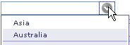
The selections binding of Chooser populates the drop down
that users can select from without typing in anything.
The application can specify an optional "short" list of selections here.
This is useful for things like choices that are popular or were recently selected by the user.
The application can also provide a source for the "full" list which could be from the database or a search index.
Let's add this to Main.java:
import ariba.ui.widgets.ChooserSelectionSource;

public ChooserSelectionSource _chooserSelectionSource;

public void init ()
{
    ...
    List continents = ListUtil.arrayToList(Continent.values());
    _chooserSelectionSource =
        new ChooserSelectionSource.ListSource(continents, "name");
}
A selection source implements ChooserSelectionSource which is responsible for
matching on the short list and full list given a search pattern.
Here, we used a simple implementation that does infix matching on a list of items.
Next, we need to create a ChooserState object for the Chooser to store
the selected object and other UI states:
import ariba.ui.widgets.ChooserState;
import ariba.ui.widgets.ChooserSelectionState;

public class Main extends AWComponent implements
    ChooserSelectionState

public ChooserState _chooserState;

public void init ()
{
    ...
    _chooserState = new ChooserState(this);
}

/**
    Implements ChooserSelectionState
*/
public void setSelectionState (Object selection, boolean selected)
{
    _newPost.continent = selected ? (Continent)selection : null;
}

public Object selectedObject ()
{
    return _newPost.continent;
}

public List selectedObjects ()
{
    // only multi-select mode
    return null;
}

public boolean isSelected (Object selection)
{
    return selection.equals(_newPost.continent);
}
We need to implement ChooserSelectionState rather than simple bindings since
selection can happen in the Chooser panel, outside of the context of our Main component.
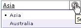
The current selection is indicated with a dot in the drop down menu.
We need to regenerate our selection short list when a selection is made.
So we add an invalidation flag like this:
private boolean _invalidateContinentSelections = true;

public void renderResponse (AWRequestContext requestContext,
                            AWComponent component)
{
    if (_invalidateContinentSelections) {
        _continentSelections = null;
        _invalidateContinentSelections = false;
    }
    super.renderResponse(requestContext, component);
}

public void setSelectionState (Object selection, boolean selected)
{
    _newPost.continent = selected ? (Continent)selection : null;
    _invalidateContinentSelections = true;
}
With these in place, The Chooser will match against the short list first.
If no match is found and the allowFullMatchOnInput is true,
then it will match on the full list.
Sometimes the default ChooserPanel is not enough.
Let's see how we can provide a custom Chooser panel for our GuestBook...
Customizing the Chooser
We start by providing the searchAction binding in rules.oss:
class=app.Post field=continent operation=create {
    component:Chooser;
    bindings:{
        ...
        searchAction:${requestContext.pageComponent().chooserSearchAction()};
    }
}
And implement the chooserSearchAction in Main.java:
public ContinentChooser chooserSearchAction ()
{
    ContinentChooser chooser =
        pageWithClass(ContinentChooser.class);
    chooser.setup(_chooserState);
    return chooser;
}
We pass the chooserState to the panel component so it can set the selection.
Next, define ContinentChooser.awl:
<w:ModalPageWrapper title="Select a Continent" editable="$false">
    <a:Image filename="app/continents.gif" useMap="#ContinentMap"/>
    <map name="ContinentMap">
        <a:For list="$Continents" item="$currentContinent">
            <a:Area action="$continentClicked"
                    shape="circle"
                    coords="$currentCoords"
                    alt="$currentContinent.name"/>
        </a:For>
    </map>
</w:ModalPageWrapper>
We are using a HTML image map with AWArea to bind the client click
to an action in our server component.
We get our continents.gif from this Wikipedia
page. The complete ContinentChooser.java looks like this:
package app;

import ariba.ui.aribaweb.core.AWComponent;
import ariba.ui.widgets.ModalPageWrapper;
import ariba.ui.widgets.ChooserState;
import ariba.util.core.MapUtil;

import java.util.Map;

public class ContinentChooser extends AWComponent
{
    public static Continent[] Continents = Continent.values();
    private static Map<Continent, String> Coordinates;
    static {
        Coordinates = MapUtil.map();
        Coordinates.put(Continent.NorthAmerica, "200,100,50");
        Coordinates.put(Continent.SouthAmerica, "250,250,50");
        Coordinates.put(Continent.Europe, "450,75,30");
        Coordinates.put(Continent.Asia, "550,100,50");
        Coordinates.put(Continent.Africa, "400,200,50");
        Coordinates.put(Continent.Australia, "650,250,30");
        Coordinates.put(Continent.Antarctica, "400,400,20");
    }
    private ChooserState _chooserState;
    public Continent _currentContinent;

    public boolean isClientPanel()
    {
        return true;
    }

    public void setup (ChooserState chooserState)
    {
        _chooserState = chooserState;
    }

    public String currentCoords ()
    {
        return Coordinates.get(_currentContinent);
    }

    public AWComponent continentClicked ()
    {
        _chooserState.setSelectionState(_currentContinent, true);
        ModalPageWrapper.prepareToExit(this);
        return ModalPageWrapper.returnPage(this);
    }
}
We build a map from continent to coordinates (x, y, and radius) on the image map
used in the AWFor iteration.
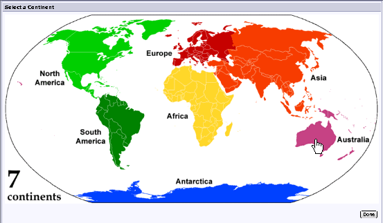
Now when we clicked on "Search for more..." on the Chooser,
we get a visual way of selecting the continent we want.
Other Areas to Explore
- The AutoAjax guide demostrates other AutoAjax facilities.
Back to Documentation